Auxtech.
- CLIENT
- Auxtech
- INDUSTRY
- Software development agency / IT services
- WHAT WE DID
- UX & UI design, frontend development, content structure, on-page SEO
- PLATFORM
- Custom frontend (Vite + Tailwind CSS)
- YEAR
- 2025–2026
( THE BRIEF )
The challenge
Software agencies compete in a crowded market where most sites look and sound the same: the same stock illustrations, the same promises, the same list of technologies. Buyers struggle to tell a senior team from a cheap one.
Auxtech needed a site that proved its craft on sight, explained a broad service range (custom software, mobile, SaaS, digital transformation) without overwhelming visitors, and gave buyers enough clarity on process and pricing to start a conversation.
Buyers of custom software are making a large, risky decision. Before they book a call, they want to know who will actually do the work, how the project will run in the first weeks and roughly what it will cost. A site that answers those questions up front earns better-qualified enquiries.
The client
Auxtech is a boutique software studio that designs and engineers websites, mobile apps, ecommerce and SaaS products for ambitious teams. Its pitch is "a studio, not a factory": senior designers and engineers on every project, one team from strategy to ship.
This software agency website design case study shows how Xenishio Arc designed and built a fast Vite and Tailwind CSS site that proves that pitch on sight.
What we built
We designed a dark, high-contrast marketing site that behaves like a product. For a software studio, the website itself is the most convincing portfolio piece, so it had to feel as polished as the software Auxtech ships.
The homepage moves from a bold "Software worth being proud of." hero and free-audit CTA into a carousel of capability cards (AI/ML, DevOps, Product, Security, Fintech), a client-logo marquee, animated stat counters, and interactive UI vignettes: a deploy inbox, a CI checklist and a command palette that show what working with the studio feels like. Showing real workflows says more about engineering discipline than any adjective could.
Further down, the page covers industry solutions, a four-step process, an "in every build" checklist, selected case studies, a first-14-days timeline, an "usual agency vs. Auxtech" comparison, testimonials, pricing and an FAQ. A persistent Cost Calculator button and a chat launcher stay on screen throughout.
Dedicated service pages (Custom Software, Mobile Apps, SaaS Development, Digital Transformation) and a light-themed Pricing page with fixed-price, retainer and dedicated-team tiers, care plans and a first-sprint guarantee carry the story further. Transparent pricing filters out poor-fit enquiries and gives serious buyers the confidence to get in touch.
( THE SITE, PAGE BY PAGE )
Scroll through it.
Hover to auto-scroll · scroll inside the frame



( WHAT WENT INTO IT )
Inside the software agency website.
- Pill-style sticky navigation with mega-menu dropdowns (Services, Solutions, Works, About, Resources)
- Hero with social-proof avatars, rating and a "Get a free audit" lead magnet
- Auto-scrolling capability card carousel and client-logo marquee
- Animated count-up statistics
- Interactive product-style UI demos (deploy feed, CI checks, command palette)
- Floating cost calculator and chat entry points
- Pricing page with engagement tiers, per-service starting prices and care plans
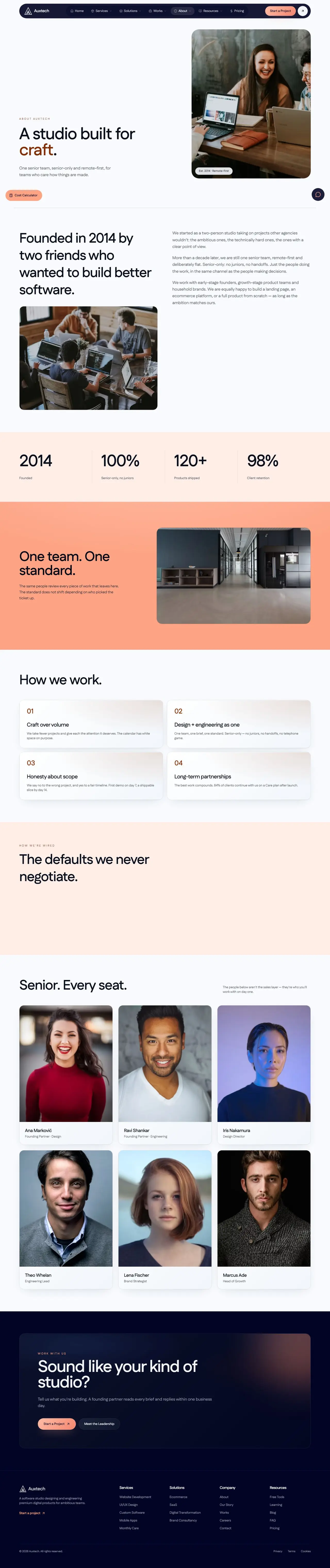
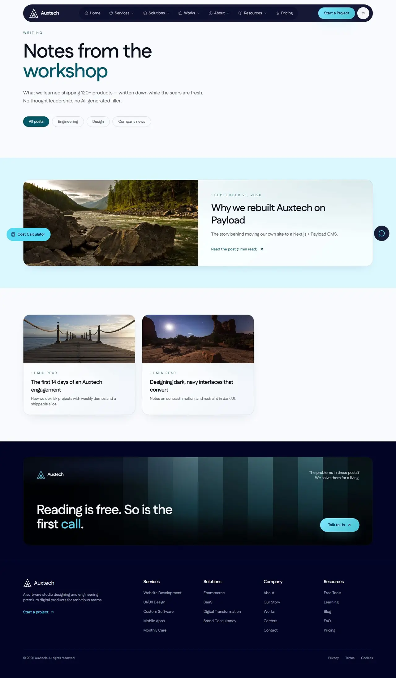
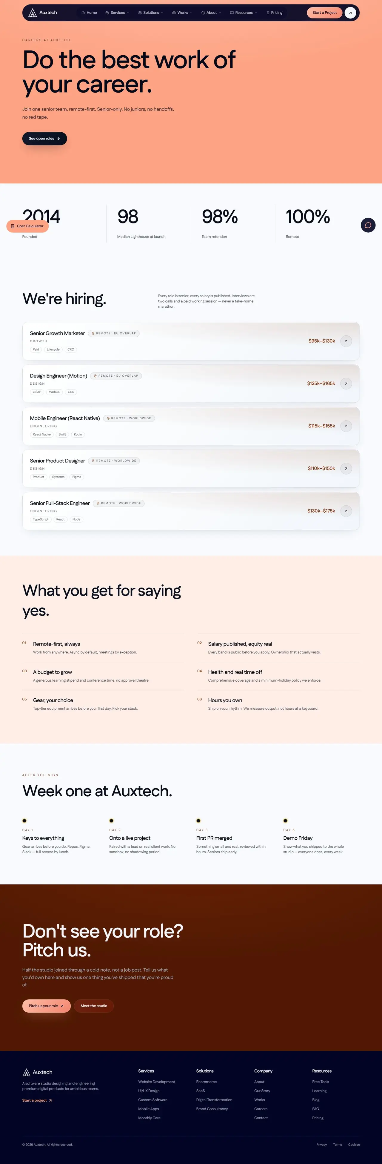
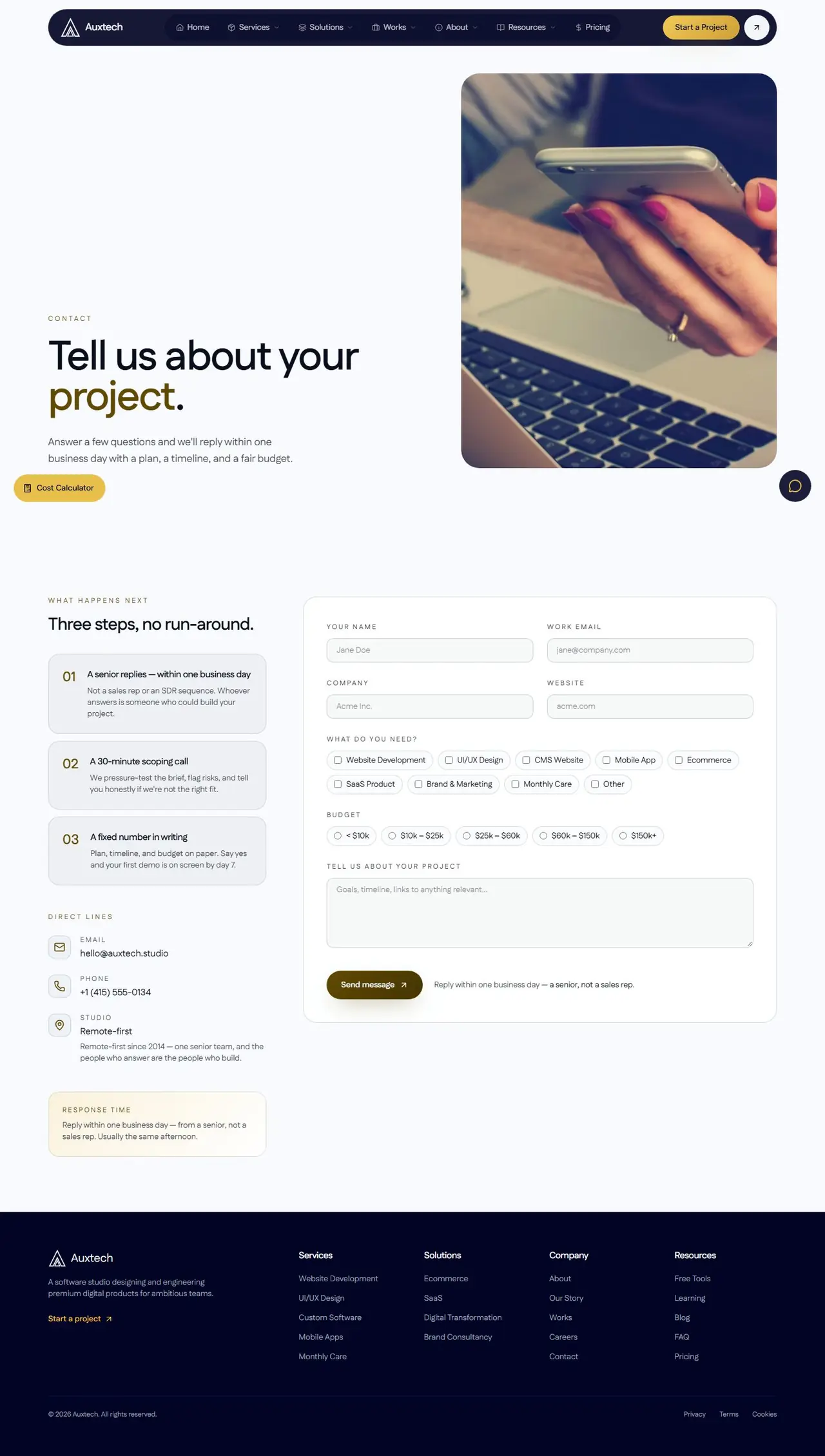
- Dedicated service, story, careers, resources, blog and FAQ pages
- Cookie, privacy and legal pages
Fustat (Google Fonts) one geometric sans across display headings and body copy, with tight tracking on large headlines and uppercase micro-labels
- #020425Background (deep navy)
- #F3F5F8Text (off-white)
- #E8BE4APrimary CTA (gold)
- #5EE09ASecondary accent (mint green, pricing/service pages)
- #F5F7FALight surface (inner pages)
Dark-mode-first with a faint blueprint grid behind the hero, glassy rounded cards, pill buttons, and imagery set in large rounded tiles. Inner pages such as Pricing switch to a light canvas with mint-green highlights while keeping the same card language, so the site feels like one system even as the mood changes.
- Framework / build
- Vite
- Styling
- Tailwind CSS
- Fonts
- Google Fonts (Fustat)
- Analytics
- Google Analytics
- Hosting / server
- LiteSpeed web server
- One site now presents the full offer, from services and process to pricing and proof, so prospects arrive at a call already informed.
- Several lead paths (free audit, cost calculator, chat, project form) capture buyers at different levels of readiness.
- A static, utility-first build keeps the site fast and easy to extend with new service and case-study pages.
- Interactive UI demos show the studio's working style directly instead of describing it.