Studiodota.
- CLIENT
- Studiodota
- INDUSTRY
- Architecture & engineering
- WHAT WE DID
- Brand-led web design, Next.js development, portfolio & content architecture, on-page SEO
- PLATFORM
- Next.js (React)
- YEAR
- 2025–2026
( THE BRIEF )
The challenge
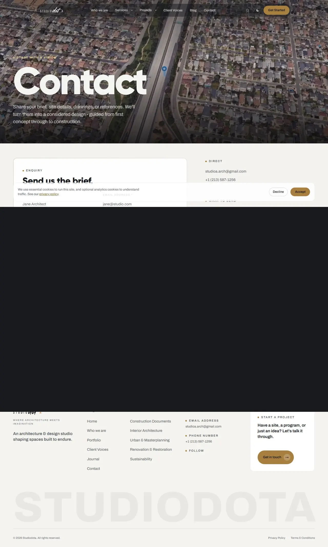
Architecture firms are judged on their work before anything else, so the site had to show a large and varied portfolio clearly while still explaining services, process and the people behind the studio.
It also had to feel calm and considered like the buildings themselves, and still guide visitors toward an enquiry. Many architecture websites lean heavily on imagery and leave potential clients unsure what the firm actually does or how to start. Studiodota needed both the portfolio and the practical answers.
The client
Studiodota is an architecture and engineering firm founded by Nubaira Haque in 2021 with a mission to simplify complexity in design. This architecture firm website design case study covers the brand-led design and Next.js build of its website.
The practice works across Southern California on single-family homes, affordable and multifamily housing, mixed use, commercial and senior living. Its services run from construction documents and interior architecture to urban masterplanning and renovation.
What we built
We built a fast Next.js site that opens on a full-bleed aerial render with an oversized "Studio of architecture & design" headline. Next.js lets large images and many project pages load quickly, which matters for an image-heavy portfolio.
The homepage then covers who the studio is, animated stats, four service cards with sub-disciplines, a numbered featured-projects list, a showreel block, a clickable six-step process (Consultation to Project Completion), a selected-works slider, an FAQ with a "book a 15-min call" prompt, and the latest journal articles.
- 01 Filterable portfolio the Projects page is a two-column grid of project tiles covering housing, residences, interiors and floor plans. Filters let a developer looking for housing work or a homeowner looking at residences see the most relevant projects first.
- 02 Project detail pages each project has its own page, giving the work room to breathe and giving search engines a page for every project.
- 03 Interactive process explorer the six steps from Consultation to Project Completion are clickable, so clients can see what working with the studio involves before they call.
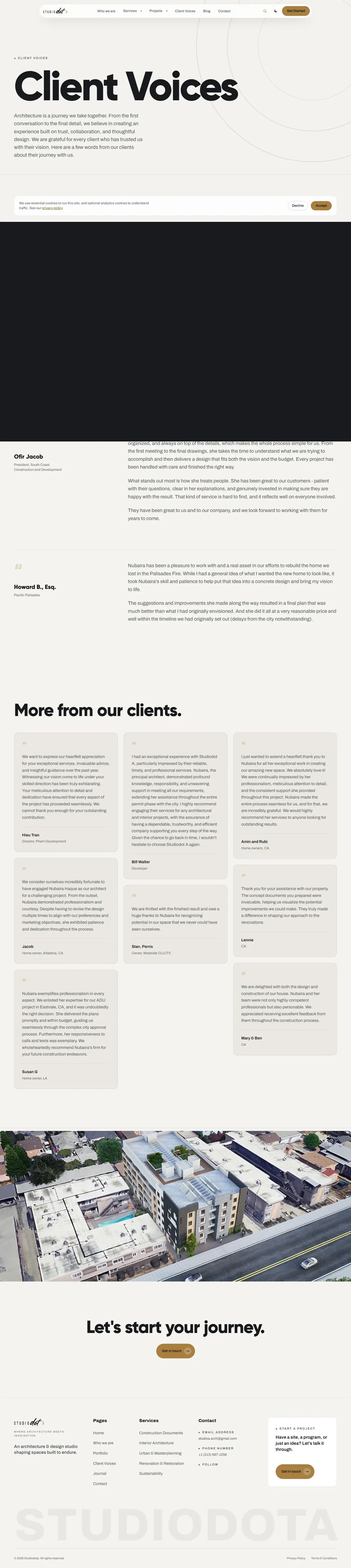
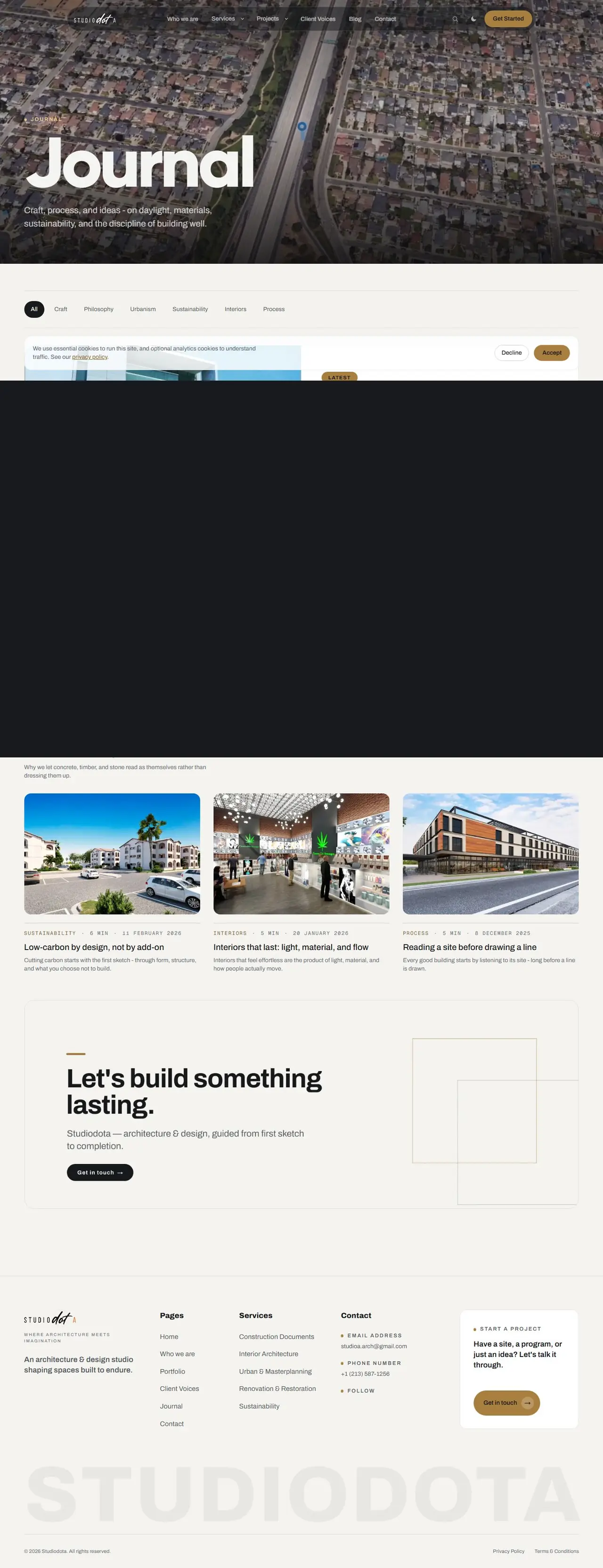
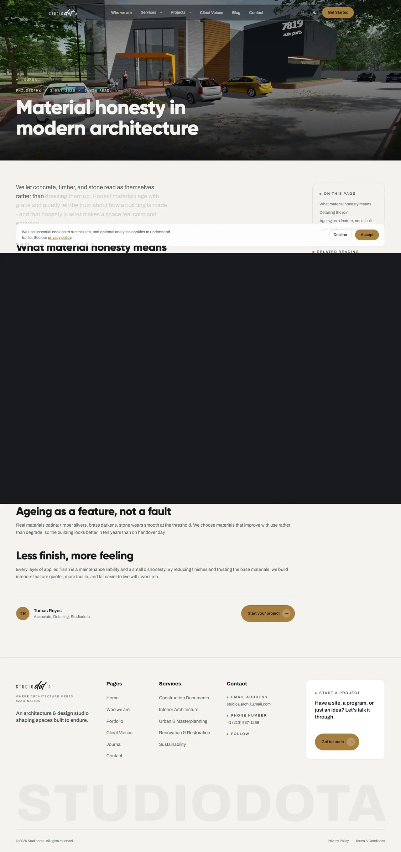
- 04 Journal and Client Voices long-form articles and a dedicated testimonials page show the thinking behind the work and what clients say about it.
- 05 Search and light/dark mode site search and a light/dark mode toggle round out the experience and make a large site easier to explore.
- 06 Low-friction enquiry the FAQ answers common questions and ends with a "book a 15-min call" prompt, a smaller first step than a formal project brief.
( THE SITE, PAGE BY PAGE )
Scroll through it.
Hover to auto-scroll · scroll inside the frame



( WHAT WENT INTO IT )
Under the hood.
- Full-bleed hero render with glassy floating pill navigation
- Light/dark theme toggle and site-wide search
- Filterable project portfolio with individual project case pages
- Interactive six-step process explorer
- Showreel / video block and selected-works slider
- Animated count-up statistics
- Services hub with four service lines and sub-disciplines
- Journal (blog) with category-tagged articles
- Client Voices testimonials page
- FAQ accordion with a "book a free call" CTA
- Consent-aware cookie banner (essential vs. analytics)
Archivo for both headlines and body, with large display sizes, a two-tone headline treatment (gold-tinted first word) and wide-tracked uppercase labels.
- #F4F3EFBackground (warm stone)
- #17191CText (charcoal)
- #F6F5F2Button text on dark (68% opacity)
- #B08540Primary accent (bronze/gold)
- #E8D3A8Highlight (pale gold)
Warm, editorial and architectural, with plenty of whitespace, a restrained neutral palette with one bronze accent, large photographic and rendered imagery, rounded pill buttons and a semi-transparent pill header over hero imagery.
- Framework
- Next.js (React)
- Styling
- Tailwind CSS
- 3D / graphics
- Three.js (detected at runtime)
- Fonts
- Archivo
- Analytics / marketing
- Google Analytics, Meta Pixel (consent-gated)
- Hosting / CDN
- Hostinger (hcdn)
- The studio's full body of work, from concept studies to construction documents, is now browsable in one structured portfolio.
- Clear service and process content plus a low-friction "book a 15-min call" CTA shortens the path from browsing to enquiry.
- The journal gives the practice a home for thought leadership and ongoing SEO content.
- The calm, editorial design reflects the studio's mission to simplify complexity in design.