Vermola.
- CLIENT
- Vermola
- INDUSTRY
- Fashion e-commerce, women's dresses and occasionwear
- WHAT WE DID
- Store design, Shopify theme customization, collection architecture and navigation, merchandising
- PLATFORM
- Shopify (Shrine PRO theme, customized)
- YEAR
- 2025–2026
( THE BRIEF )
The challenge
Occasionwear shoppers browse by moment, silhouette and color, and they expect a magazine-quality experience. Someone shopping for a wedding-guest dress usually starts with the event, then narrows down by length or color, and they want to see the dress styled before they buy it.
Vermola needed a store that feels editorial but still converts. That meant a deep catalog that is easy to navigate, promotions that create urgency without cheapening the brand, and a smooth mobile checkout for an international audience. Fashion brands face this tension often: too much campaign imagery hides the products, while too much discounting makes a premium label look cheap.
The client
Vermola is a women's fashion brand born in Barcelona. It curates feminine, timeless occasionwear inspired by Mediterranean evenings, with mini, midi and maxi dresses for weddings, birthdays and celebrations, plus bags, jewellery and accessories. This Shopify fashion store design case study covers how we built a store that feels like a magazine and still sells.
Vermola sells internationally in USD, AUD, CAD and NZD, so the store had to work just as well for a customer in North America as for one in Australia or New Zealand.
What we built
We designed the store and customised the Shrine PRO theme on Shopify, then planned the collection architecture and navigation around the way occasionwear customers actually shop. Campaign imagery leads, but every editorial section links straight to products.
Merchandising and conversion tools were added carefully, so urgency and reassurance support the brand rather than compete with it.
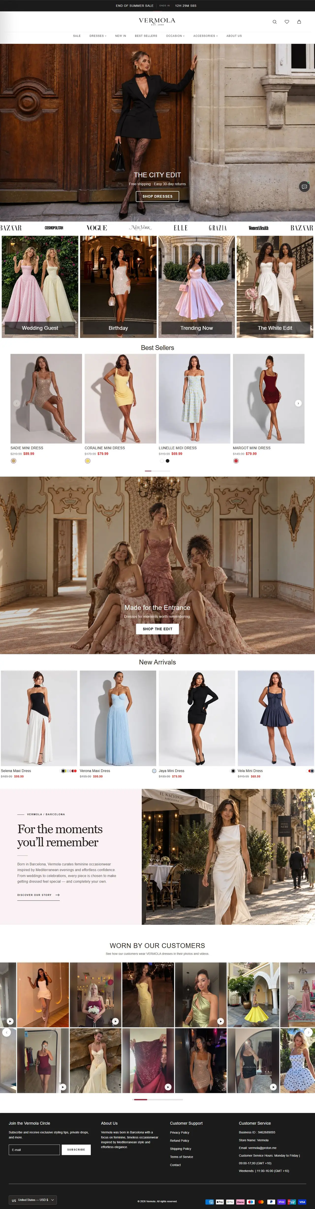
- 01 Editorial homepage full-bleed campaign heroes ("The City Edit", "The Dress Edit"), an "as seen in" press logo strip, and shoppable edits for Wedding Guest, Birthday, Trending Now and The White Edit. Shoppers can start from an occasion instead of a product category.
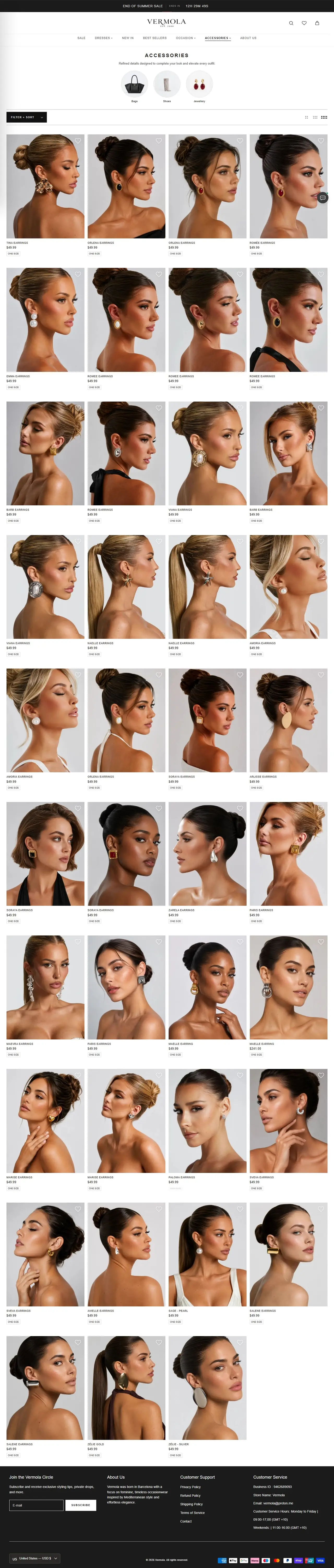
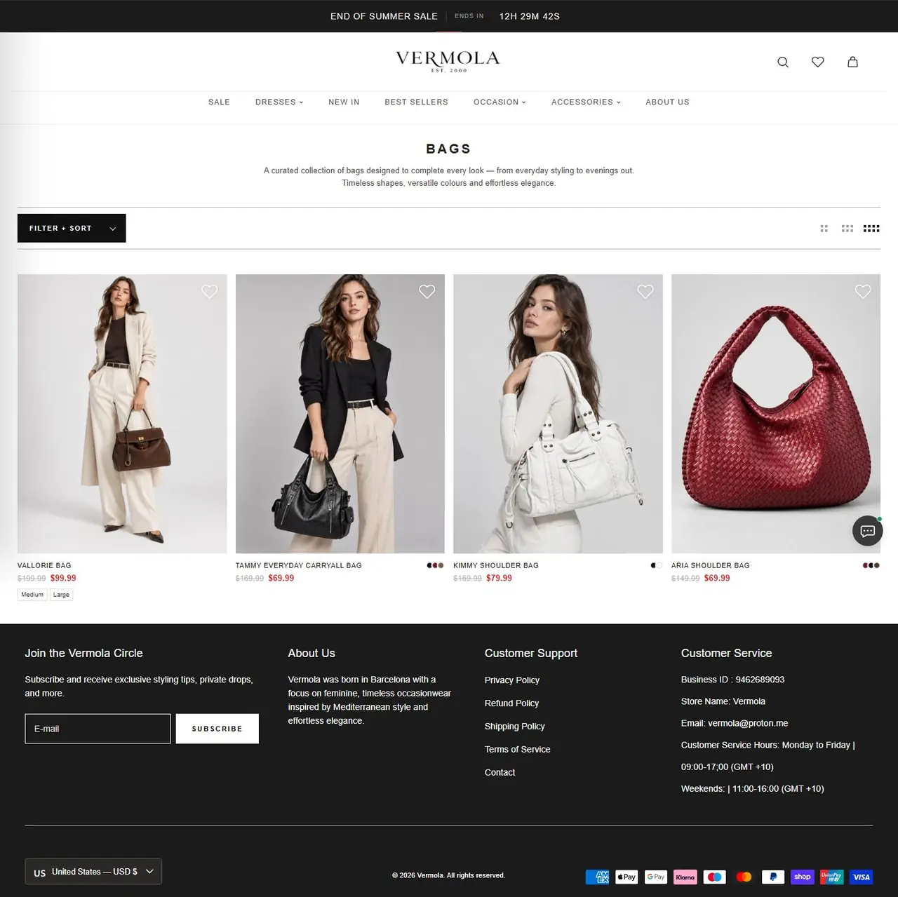
- 02 Collection architecture a mega-menu that organizes dresses by length (mini, midi, maxi), print (floral), color (black, white, red, pink, blue, green, brown, yellow and gold, multicolor) and occasion (wedding guest, birthday, swimwear). Accessories are split into jewellery, bags and shoes. The same dress can be found from several starting points, which matches how people browse for an event.
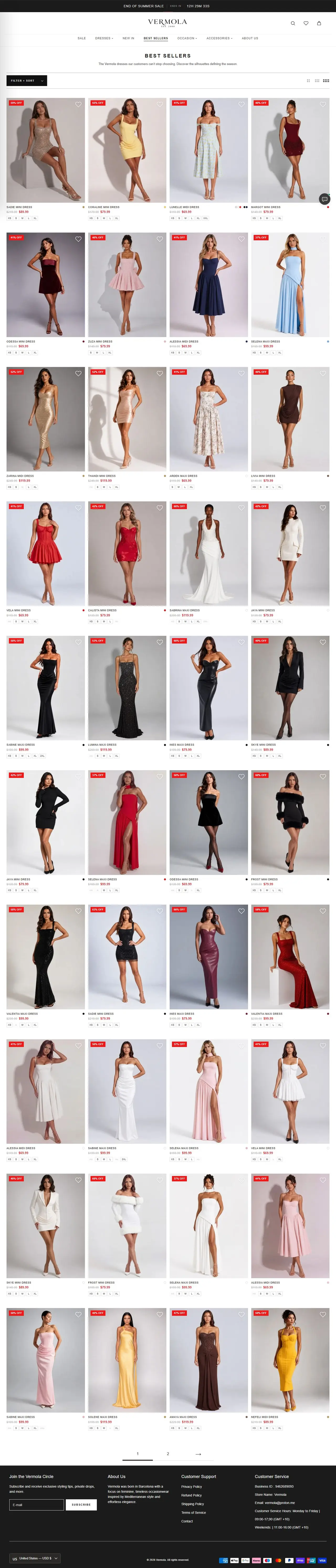
- 03 Merchandising Best Sellers and New Arrivals carousels with compare-at prices, a "Made for the Entrance" feature, a brand story block (VERMOLA / BARCELONA) and a "Worn by our customers" UGC section. Customer photos show how the dresses look in real life, which reassures first-time buyers.
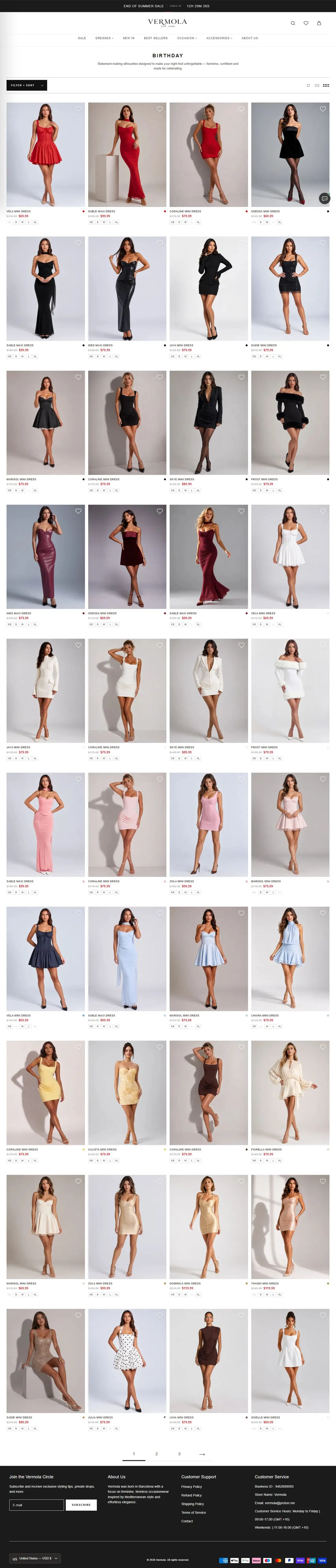
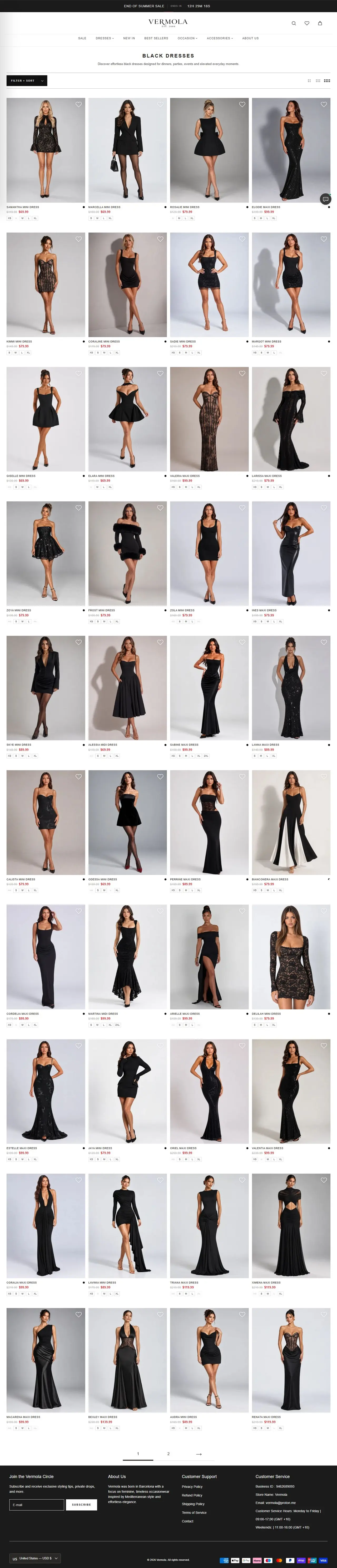
- 04 Collection pages each has visual sub-category bubbles, a filter and sort drawer, density toggles, a four-column product grid with swatches and size chips, wishlist hearts and pagination. Swatches and size chips let shoppers check availability without opening every product.
- 05 Conversion tools a sale countdown bar, a free shipping and 30-day returns message, a live chat widget, the "Vermola Circle" newsletter signup and a country/currency selector. Clear returns and local currency remove two common reasons international shoppers abandon a fashion order.
( THE SITE, PAGE BY PAGE )
Scroll through it.
Hover to auto-scroll · scroll inside the frame

( WHAT WENT INTO IT )
Under the hood.
- Mega-menu shopping by length, color and occasion
- Countdown announcement bar for campaigns
- Product grids with swatches, sizes, sale pricing and wishlist
- Customer UGC gallery and press logo strip
- Multi-currency storefront (USD, AUD, CAD, NZD)
- Express checkout with Shop Pay, PayPal, Apple Pay and Google Pay
- Live chat support widget
- Meta Pixel and Google Analytics tracking for paid social
Helvetica / neo-grotesque sans for navigation and UI, set in wide-tracked uppercase. A refined high-contrast serif wordmark ("VERMOLA, EST. 2000") is used for the logo.
- #FFFFFFBackground
- #121212Text
- #1C1B1BPrimary button / announcement bar
- #FFFFFFButton text
- #D0312DSale price red
- #C9B8A6Warm neutral (imagery)
Minimal luxury fashion. A monochrome black-and-white UI lets warm, Mediterranean campaign photography lead, with uppercase micro-typography, generous product imagery and outlined CTAs over full-bleed images.
- Platform
- Shopify
- Theme
- Shrine PRO 1.3 (customized)
- Frontend
- Liquid, jQuery
- Payments
- Shopify Payments / Shop Pay, PayPal, Apple Pay, Google Pay
- Analytics / marketing
- Google Analytics, Meta Pixel, Shopify Web Pixels
- Security
- reCAPTCHA
- CDN
- Shopify CDN / Cloudflare
- Shoppers can reach the right dress by occasion, color or length in one or two clicks.
- The editorial presentation gives the brand a premium feel that supports full-price and campaign sales.
- International buyers see local currency and familiar express payment options at checkout.
- Customer photos, press logos and clear returns information give first-time buyers reasons to trust the brand.