TagMango.
- CLIENT
- TagMango
- INDUSTRY
- SaaS / Creator economy & EdTech
- WHAT WE DID
- UI/UX design, Webflow development, landing & comparison pages, pricing page
- PLATFORM
- Webflow
- YEAR
- 2025–2026
( THE BRIEF )
The challenge
TagMango's product spans a dozen tools (courses, workshops, community, payments, funnels, affiliates, branded apps, AI). Broad platforms often struggle to explain themselves: list every feature and visitors get lost, but simplify too much and serious buyers can't see whether it covers their needs.
The marketing site needed to make that breadth feel simple, earn the trust of serious creators, compete head-on with alternatives like Skool and Graphy in search, and send visitors cleanly to sign-up or a demo, all while staying easy for the in-house team to update.
The client
TagMango is an AI-powered platform that lets creators and coaches host live workshops, sell courses, run memberships and communities, and launch branded apps from one place. This Webflow SaaS website case study covers the UI/UX design and Webflow build of its marketing site.
Its pitch is "Build your one-person startup", with Mango AI positioned as a "100X Co-Founder" that builds, analyses and runs the business from a prompt. The website had to make that promise feel real to creators who already use several separate tools.
What we built
We designed the site as one continuous story, from the hero promise through the AI co-founder, the product tour and pricing, and built it in Webflow so the marketing team can edit pages and launch new ones without waiting on developers.
Every section ends with a clear next step, either starting for free or booking a demo, and dedicated comparison pages target creators who are already evaluating alternatives.
- 01 Hero-led narrative a centred "Build your one-person startup" headline with a rotating keyword ("memberships", "apps"…), dual CTAs (Start for FREE / Book a Demo) and a proof row of headline stats. The rotating word shows the product's range without crowding the headline.
- 02 Mango AI storytelling a dedicated section framing the AI as a co-founder, with prompt-style examples ("It builds. It thinks. It runs."). Showing prompts makes an abstract AI feature concrete.
- 03 Social proof marquee an auto-scrolling strip of well-known creator profiles with names and titles, so visitors see people like them already using the platform.
- 04 All-in-one feature system a tabbed feature overview (App Builder, Theme AI, Mango AI, Courses, Workshops, Community, Gamification, Funnel Builder, Payments, Analytics, Automations, Affiliates) and a "thirteen subscriptions walk in, one business walks out" animated comparison. Tabs keep a dozen tools on one screen without overwhelming the page.
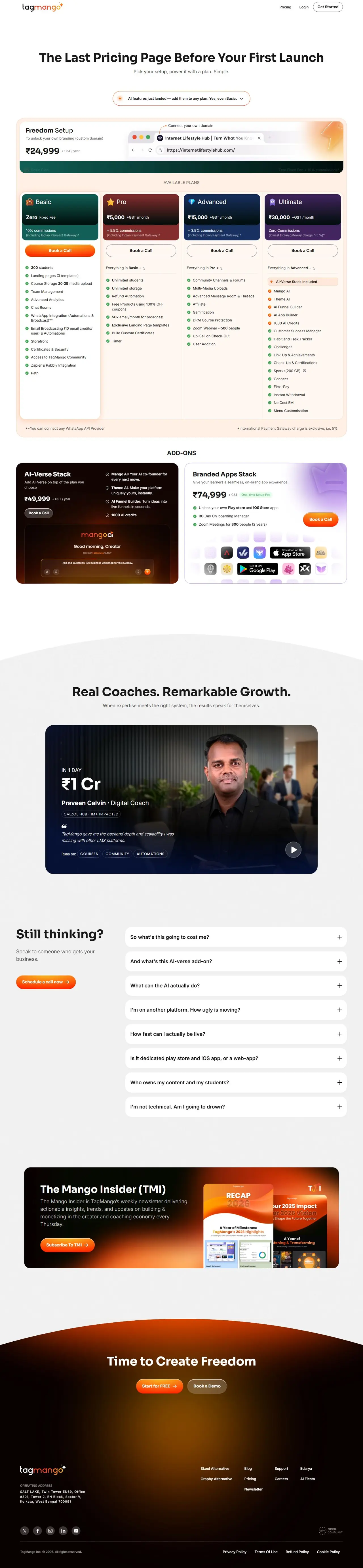
- 05 Pricing page four plan cards (Basic, Pro, Advanced, Ultimate) with colour-coded headers, an add-ons row (AI-Verse Stack, Branded Apps Stack), a video testimonial block, FAQ accordion and newsletter promo. The FAQ answers objections right where buying decisions are made.
- 06 SEO comparison pages "TagMango vs Skool" and "TagMango vs Graphy" pages targeting high-intent competitor searches. People searching for comparisons are usually close to choosing a platform.
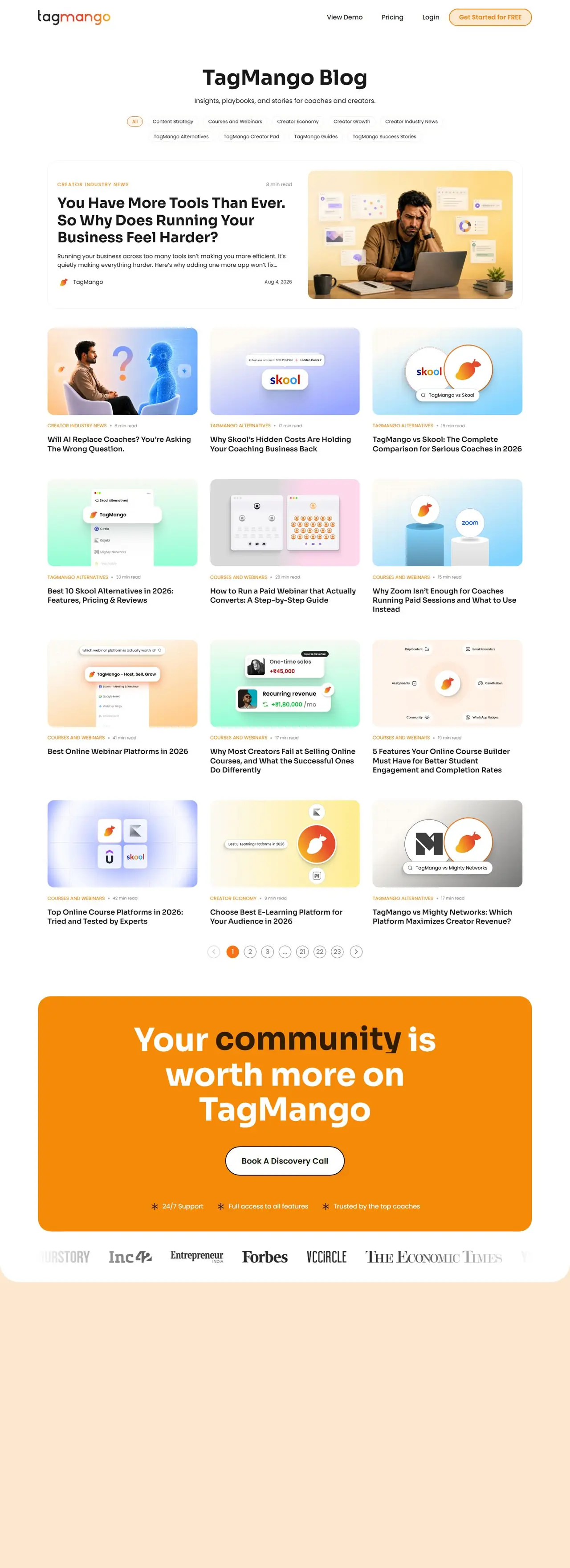
- 07 Blog, legal and sign-up flows a blog index, privacy, terms and refund policy pages, and a hand-off to the web app sign-up.
( THE SITE, PAGE BY PAGE )
Scroll through it.
Hover to auto-scroll · scroll inside the frame




( WHAT WENT INTO IT )
Under the hood.
- Dark, cinematic hero with warm orange radial glow
- Rotating hero keyword and animated stat counters
- Infinite-scroll creator testimonial marquee (Swiper)
- Tabbed "TagMango Universe" product tour
- Four-tier pricing with add-on stacks and FAQ accordion
- Competitor comparison landing pages for SEO
- Persistent "Get Started" / "Book a Demo" conversion CTAs
- Fully responsive layout with a pill-button mobile header
Sora display headings and stats (geometric, high-impact)
Inter body copy and UI
- #080100Background (near-black)
- #FFFFFFText
- #FB5C0CPrimary accent / CTA gradient (mango orange)
- #FFFFFFSecondary button (glass)
- white and soft peach surfacesPricing/light sections
A dark-mode SaaS aesthetic with a glowing orange-to-amber gradient echoing the "mango" brand, glassy pill buttons, large rounded cards, and light sections (pricing, FAQ) for contrast. Generous whitespace and centred, conversational copy keep a busy product feeling calm.
- CMS / site builder
- Webflow (assets on cdn.prod.website-files.com)
- Frontend libraries
- jQuery 3.5.1 (Webflow runtime), Swiper
- Fonts
- Google Fonts (Inter, Sora)
- Analytics / marketing
- Google Tag Manager, Google Analytics
- CDN / edge
- Cloudflare, Amazon CloudFront
- Payments
- Handled inside the TagMango app (not on the marketing site)
- A single, coherent story for a very broad product, from hero to pricing.
- Dedicated competitor pages give TagMango a foothold in high-intent "alternative" searches.
- A Webflow build the marketing team can update and extend without developers.
- Start for free and Book a Demo calls to action appear throughout, so visitors always have a clear next step.